Phone 4a Glyph Refresh Unveiled as Nothing Teases Restyled Lighting
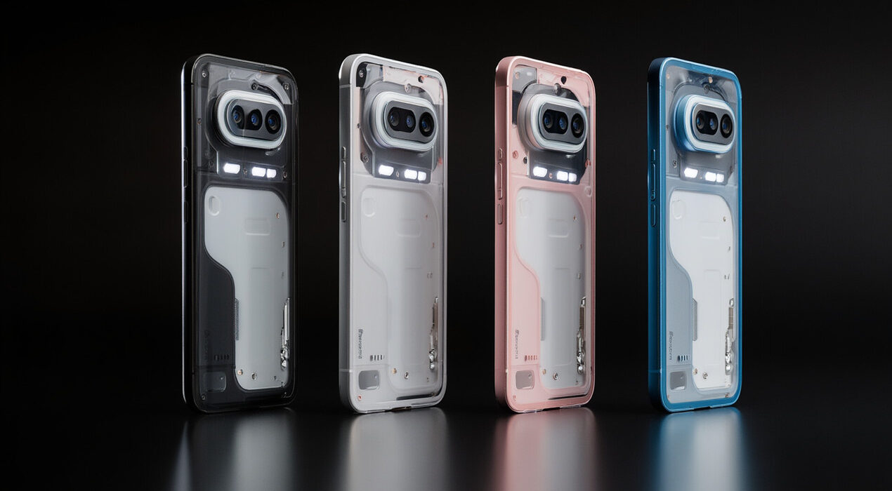
The Phone 4a Glyph lighting system just received a bold refresh. Nothing officially revealed the updated design ahead of launch. As a result, fans now have a clearer idea of what to expect. The brand built its identity around transparent aesthetics. However, this time it has refined the rear lighting layout. The update focuses on cleaner lines and sharper LED placement. Nothing first introduced the Glyph interface with earlier models. For example, the Nothing Phone (1) featured segmented light strips. Later devices continued the signature look.
What’s New in the Lighting Design
The Phone 4a Glyph appears more structured and minimal. Designers reshaped the LED strips to create a sleeker pattern. Therefore, notifications may feel more dynamic and organized. In addition, the lighting remains customizable. Users can assign different light sequences to calls or alerts. This feature helps people stay connected without always checking the screen.
The company aims to blend design and function. Consequently, the lighting does more than look stylish. It also offers practical visual cues. Industry watchers expect the device to target mid-range buyers. Still, the refreshed lighting keeps the brand’s identity intact. That balance could attract both new and existing users. Nothing has confirmed full specifications yet. Even so, the design builds excitement before the official launch. Tech enthusiasts now wait for more details on performance and pricing. Overall, the Phone 4a Glyph refresh shows how small design tweaks can make a big impact. The updated lighting keeps the phone recognizable while pushing its visual style forward.